Accessible
Museum Experience

Enhancing the museum experience for children with sensory sensitivities

Overview

We partnered with Easterseals Crossroads and The Children’s Museum of Indianapolis to improve accessibility features currently available on The Children’s Museum’s Website.

Children with sensory sensitivities such as autism, asperges, and other sensory disorders face trouble when visiting the museum and are overwhelmed during the visit due to factors such as crowd, bright lights, loud areas around the various exhibits inside the museum. Hence, children need to be prepared in advance by parents as well as need support during the visit to the museum.

Aim: To improve and design accessibility features on The Children’s Museum website for children with sensory sensitivities and their parents.

Duration

10 -12 months
My Role


Research & Analysis
Persona
Design Concept
Low & Hi-Fi Prototype
Usability Testing

Problem Space

Children with sensory sensitivities are oversensitive or undersensitive to various factors such as noise, light, clothing, temperature, etc. and require extra care from  their parents in preparation before visiting any place.

This challenge was brought to attention by the team at EasterSeals Crossroads and The Children’s Museum of Indianapolis.

From our research, we found some of the challenges in existence as follow:

1. Parents have difficulty engaging/calming their child during new experiences.

2. Sensory Maps on the website are not interactive and do not show useful information such as crowded areas.

3. Parents want their child to be able to connect with their experience.

4. Preparing the child is 80% of the problem for parents.

Thus, to prepare the child and to keep them engaged/calm during the visit is the biggest challenges faced by most of the parents.


_____________________________

“How to design accessibility features that would help the parents in preparing the child beforehand and to keep them engaged during the visit to the museum?”

______________________________

Research & Analysis

After identifying the problem, the next step was to conduct background research and user research to find out in-depth information about the problem space.

Background Research

Current System

Currently, on The Children’s Museum of Indianapolis’s website, there are pages dedicated to accessibility which provide all the information on the services present at the museum such as emergency red phone areas, mobility services, sensory resources, etc. 


Usability Review - Accessibility Homepage

  • Too much text which makes it hard to read.
  • Aesthetically unpleasing design of the page.
  • No section at the top for the current updates regarding accessibility.
  • Hard to locate sensory resources.
  • Vague button “Learn More” at the bottom which doesn’t provide much information about what it consists.

Regarding the accessibility features, there is a campus map that provides relevant information for each part of the floor level. The maps are supported with a key which has tags for bright areas, low light areas, loud areas, quiet areas, etc. that can help parents and children get an overview of what to expect at each location. 

Usability Review - Sensory Map

  • Detailed information is available for each floor level and each exhibit.
  • Lack of interaction for the user to select floor level.
  • Text-heavy and overloaded pages with information for each floor level.
  • No route information from one location to another.
  • No sensory keys on the text pages for each exhibit.

Also, there are social narratives present on the website, which are visual stories that describe the social situations of various locations of the museums in the form of a story.

Usability Review - Social Narratives

  • Social stories are present in the form of pdf’s only to help parents prepare the child beforehand.
  • Large pictures are used to help the child view what to expect at the museum for each exhibit.
  • Inability for parents to customize and personalize the stories to enable the child to connect better.

Literature Review

We conducted a literature review to discover relevant information, processes, methods and design guidelines regarding museum accessibility as well as web accessibility.

According to multiple resources and Web Content Accessibility Guidelines (WCAG) 2.0, an accessible website is defined as one that ensures that all of its pages can be used effectively by all people using the website. People with sensory sensitivities have a wide range of conditions and may face difficulties while using the internet is the proper format is not used.

We found multiple guidelines for web accessibility designs as highlighted below for people with sensory sensitivities :

  • Navigation and layout should be consistent across the entire site.
  • Clutter and distractions should be minimized. Styles and white spaces should separate content and direct the user’s attention as appropriate.
  • The text should be as simple as possible while providing definitions for any non-standard terms.
  • User should have control over the site’s behavior. Provide clear instructions and error messages when filling out forms.
  • Avoid time limits on content or automatic refreshers when possible.

Competitive Analysis

Our team also reviewed accessibility features that are currently present on other children’s museums to evaluate their usability and to understand the current design standards that are in existence.


Every year, museums like Port Discovery Children’s Museum of Baltimore set aside two special weeks for children with special needs and their caretakers as part of the museum’s dedication to inclusive learning. The staff lowers volume and sound effects so that children with sensory sensitivities can truly enjoy the museum experience. Similarly, museum Explora (Albuquerque) has sensory-friendly dates and times mentioned on their website with the sensory-friendly entrance as well as spaces inside dedicated to people with sensory sensitivities. All of the studied websites below have sensory-friendly social stories on their websites. Most of the museums have them in downloadable pdf format. 

Hands On Children’s Museum, Washington

      Pros

  • Fun design for kids, ensuring children and parents are both engaged and interested.
  • Social stories present on the website in the form of PDF as well as text.

     Cons

  • Unresponsive website i.e. crashes or timeout and doesn’t load specific pages.
  • Hard to utilize accessibility features as well as other features on the website.

Children's Museum of Arts, New York City

      Pros

  • Easy to navigate.
  • Low learning curve for new users.
  • Simplistic and minimal design approach.

     Cons

  • Improper font size and presentation used for social stories making it difficult for users to read.
  • Lack of accessibility information on the website.
  • Hard to access and locate the existing accessibility features.

Explora, Albuquerque

      Pros

  • Aesthetically pleasing with nice visual features.
  • Good balance between text and graphics to ensure parents and children stay engaged.

     Cons

  • Outdated design and needs tone updated to current design standards.
  • After running the accessibility plugin (WAVE) over the site, numerous accessibility bugs were found through the website.

User Research

After the background research, we then moved on to conducting user research. As requested specifically by our project partners, our target users for this project were primarily parents of children with various sensory processing disorders. In addition to children, we also focused on teens with sensory sensitivities who are over the age of 18 and we looked into the problem space from the viewpoint where things could be made easier for them as well.

We also included experts from various sensory processing disability fields into our user research. This allowed us to gain better insight into industry-standard accessibility initiatives and enabled us to focus on ideal solutions to our problem from an expert’s perspective as well.

Qualitative Interviews

With our existing target user base, we conducted usability tests along with post-test interviews with 4 parents of children with sensory sensitivities. The purpose of the tests and interviews was to find out their views on the current website regarding the accessibility features, the issues, and obstacles they face as well as to learn more about their expectations.


Task 1

Please use The Children’s Museum website to find information about accessibility features regarding sensory sensitivities.

Task 2

Please locate the social stories and describe how you would utilize the social narratives present on the website.

We also conducted in-depth interviews with 2 experts who work in the field of accessibility. Experts were incorporated in the user research to understand more about accessibility issues that children face and how to approach the problem space.

Some of the interview questions from the expert’s interview script were as below:

1. What kind of information is typically needed by parents to prepare their child for a visit to a new location/event, for example, The Children’s Museum?

2. How can parents involve children during the preparation time?

3. If familiar with the TCM website, what do you think about the accessibility features currently on the website?

4. What are your suggestions for the features that should be incorporated into the website?

vv

Key Feedback

The social stories on the museum website are a big help. Being prepared for an outing is 75% of the battle when taking my daughter somewhere.
Participant 1
Parent
I love the sensory maps. They are simple, easy to read, color/icon coded and print friendly but it would be nice if I could get at the spot information during the visit.
Participant 2
Parent
I had hard time locating the accessibility features on the website. It would be nice if the features could be highlighted somehow.
Participant 3
Parent
When I take my children to museum, it is hard to keep them calm at times and make sure that they are comfortable. So, I try to avoid crowded places and prefer to go in on the not so busy days.
Participant 4
Parent
Children usually have tablets that helps parents calm the child during the times of need. It would be helpful if features could be incorporated to engage the child with the museum experience.
Expert 1
Resource Specialist
For parents, it's very helpful to have premade social stories. However, it would be nice to be able to customize the stories and add your child's name in there for them to connect with.
Expert 2
Museum Accessibility Researcher

Insights

From the usability tests on the current website as well as interviews with parents and experts, we found the following to be the user’s main concerns.

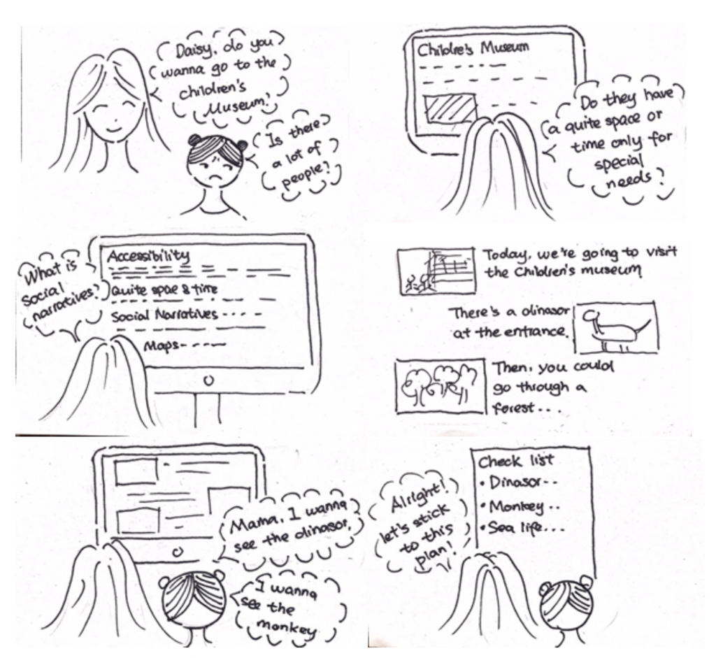
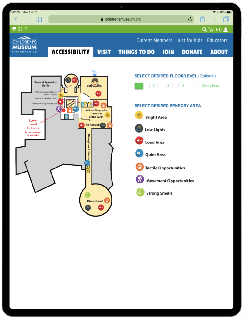
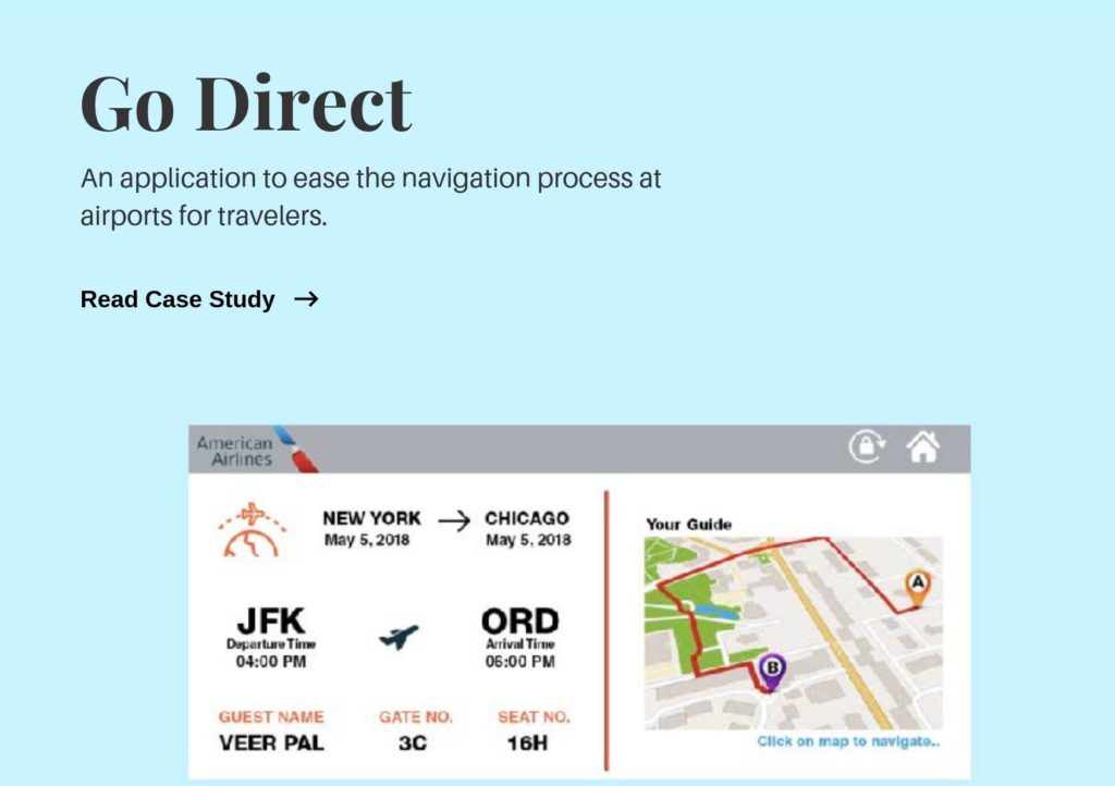
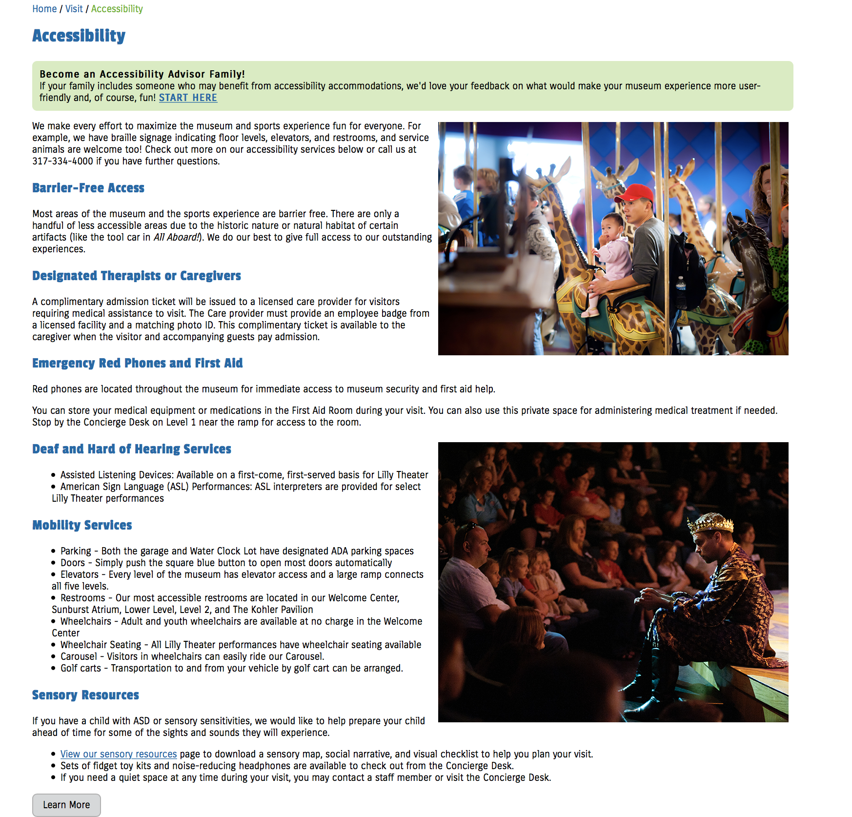
Locating accessibility features

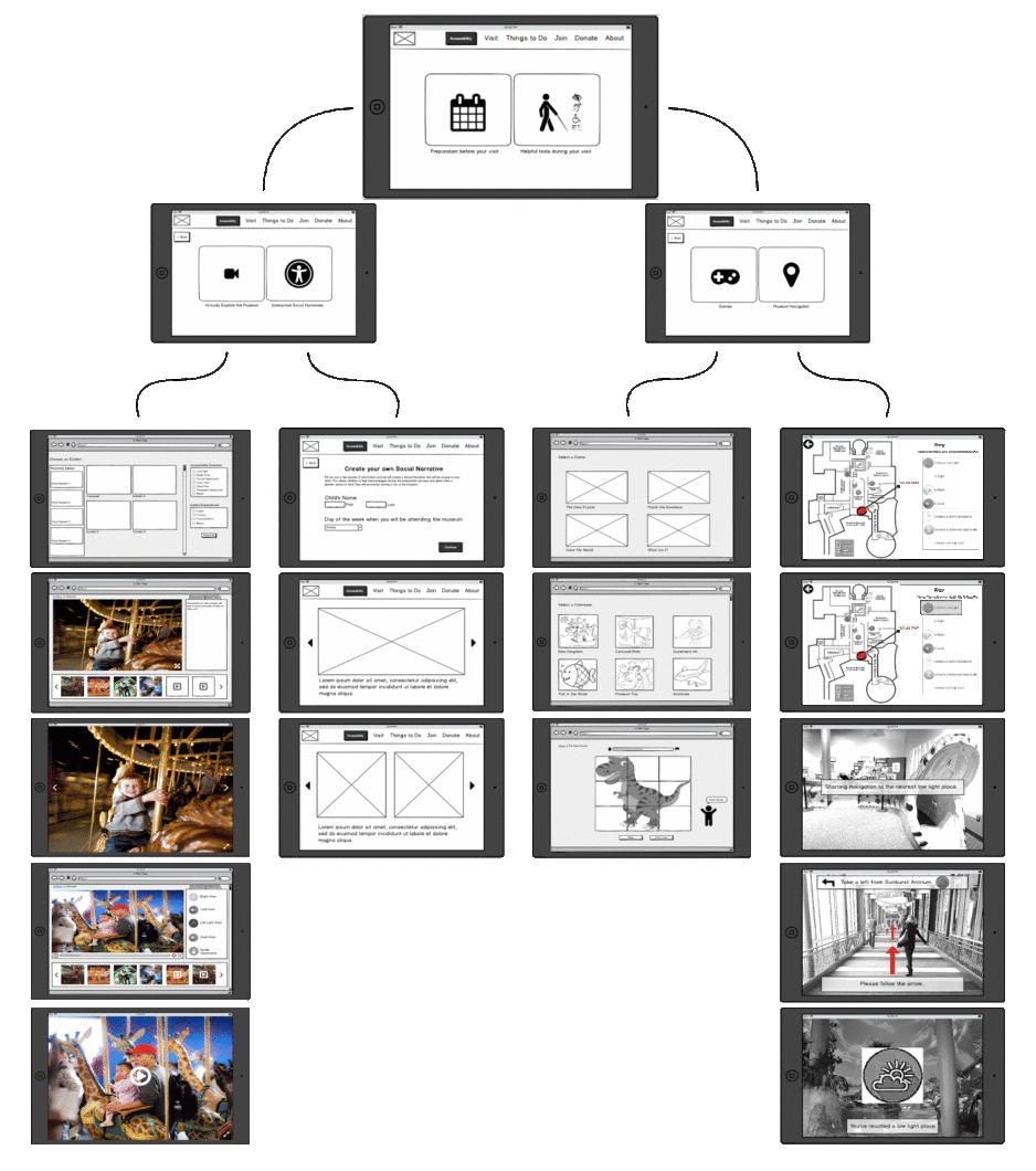
Parents had difficulty locating accessibility features on The Children's Museum website due to their location and terminology used throughout the website.

Waiting period

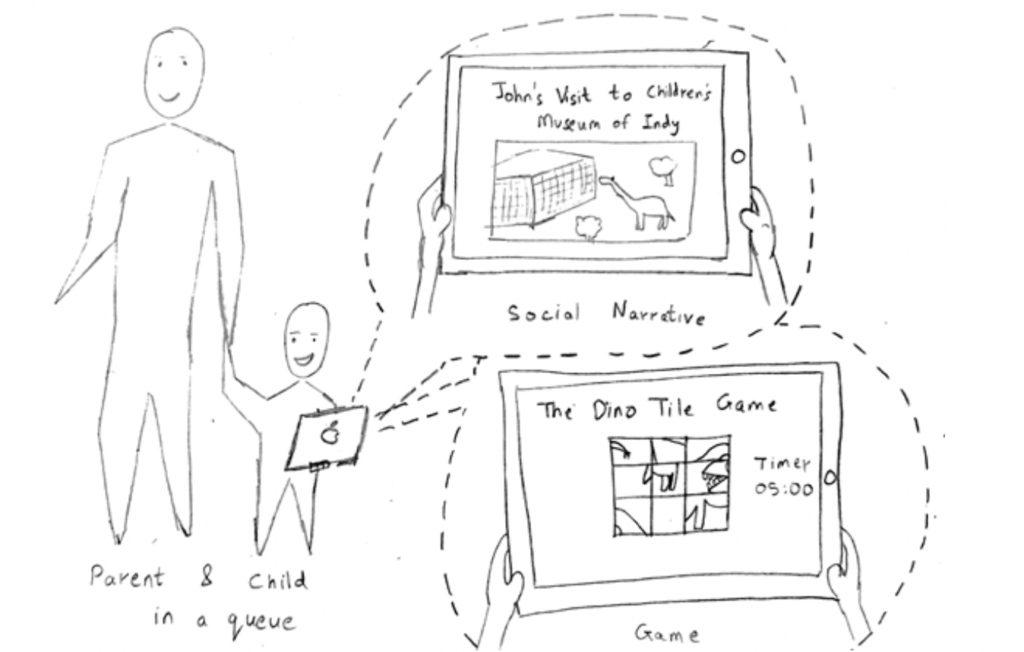
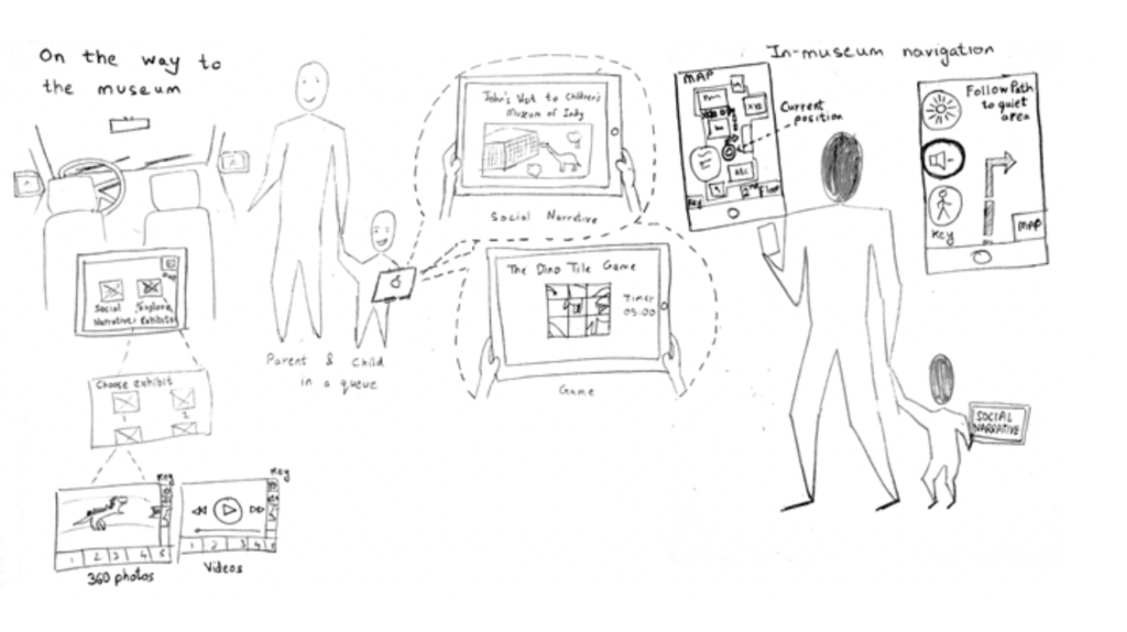
Parents face trouble calming their child during wait times such as buying tickets or getting from the parking lot to the museum.
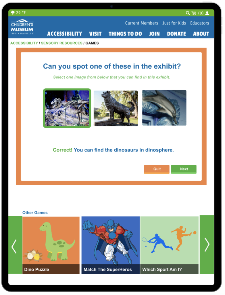
Engagement

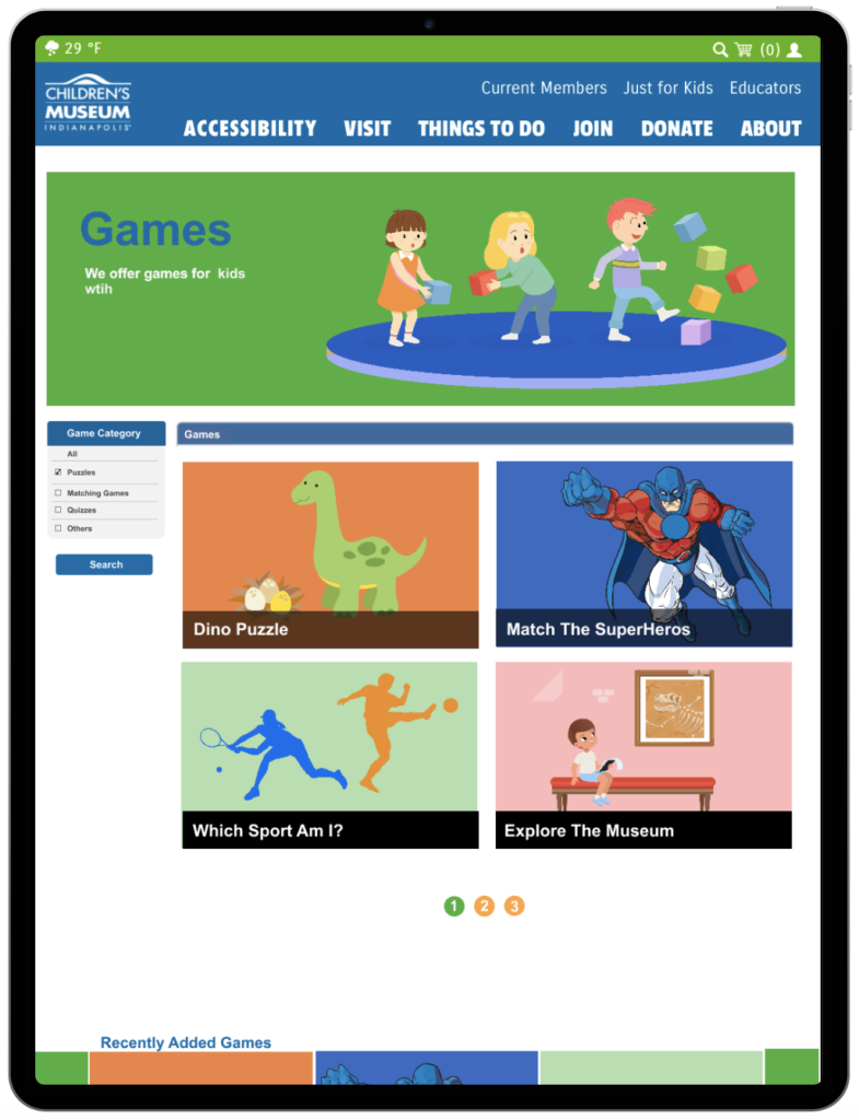
Keeping the child engaged and interested in the museum experience is another challenge faced by parents.
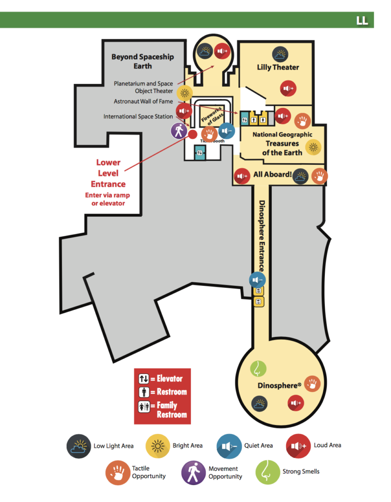
Lack of features

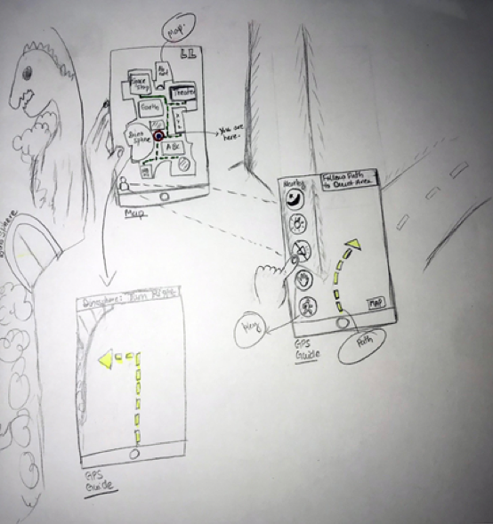
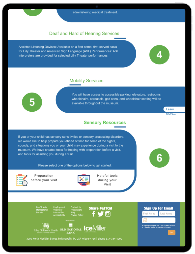
There are no features present on the sensory maps to allow parents to view which areas are popular/crowded at certain times of the day.
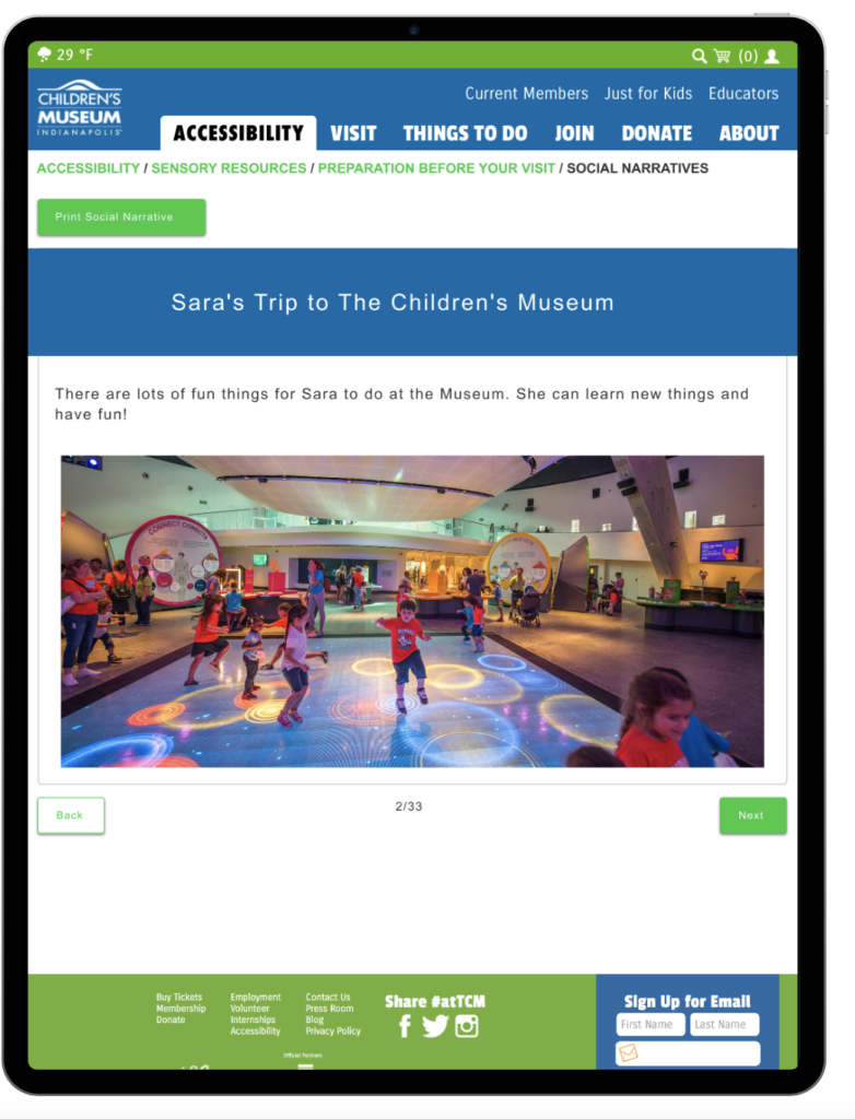
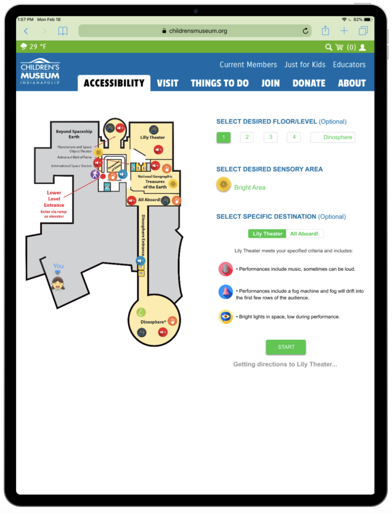
More flexibility

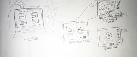
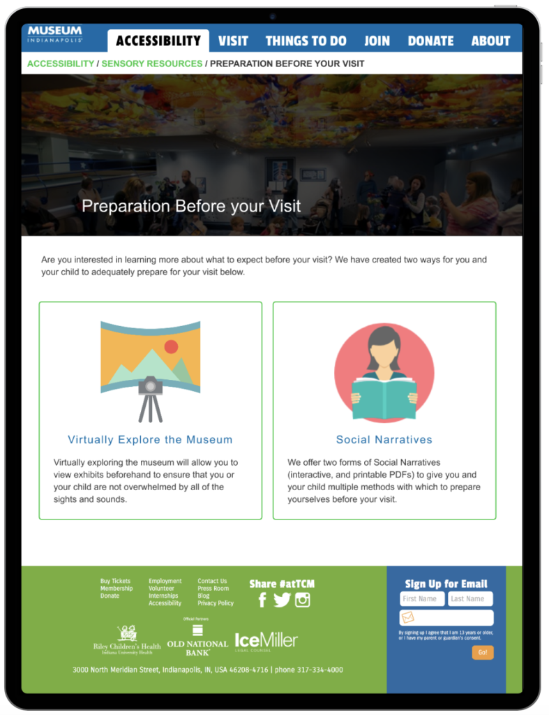
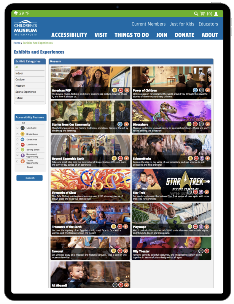
Parents wanted more control over the features on the website such as customizable social stories and the ability to use filter options whenever necessary.

Handheld devices

According to experts, parents keep handheld devices that help them keep child calm during the visit to the museum or other public places.

User Personas

We created two personas based on our research with the target users. One of our personas, presented below, depicts a mother who has a daughter with autism. Our second persona depicts a teenage boy who has autism.

Conceptualization

Feature Narrative

1. Engagement of kids

Children tend to get overwhelmed and feel uncomfortable during their trips and some entertainment features such as games should be included for parents to calm the child during the trip, wait times or when the child is not interested in the exhibits.

2. Interactive sensory maps and real-time navigation.

The current maps are static and only provide information on the location of exhibits. The user should be able to see what to expect on each floor level along with the key of sensory features i.e. loud areas, quiet areas,f etc. for each exhibit. The real-time navigation will help parents find their desired location with follow along arrows and save them time.

3. Accessible terminology

The language used on the website should be user-friendly that helps users easily identify the information they are looking for.

4. Provide acccessibility information to parents prior to visit.

To prepare the child for the visit, the website should have a well-defined structure to help parents identify their needed information quickly.

5. Highlight and make social stories/narratives interactive.

Social stories/narratives are excellent features for parents to utilize, however, these should be highlighted on the website. Also, customization feature should be incorporated (i.e. add the child’s name) so children can connect better.


Storyboard Scenario

The storyboard depicts a mother and her daughter. The mother is planning a trip to The Children’s Museum and her daughter is nervous about the trip due to the fear of the crowd. The mother utilizes The Children Museum’s website to search for quiet areas that would best help her daughter cope with the new experiences that she would face while at the museum. She finds the accessibility portion of the website and utilizes various sensory stories to give her daughter an idea of what to expect throughout the trip. This calms her daughter down and they create a checklist of areas to see, areas to avoid and which areas might be best to visit at specific times.

Design Concepts


We came up with three design concepts focused on the attempt to aid users with the five key requirements that resulted from our research and analysis. 

Concept 1

Concept 1 depicted a desktop/responsive web application that is centered around allowing children to virtually traversing the museum before they arrive via photos/videos showing the inside of each exhibit.


Concept 2

Our second concept was a mobile application that focused on real-time navigation and on guiding parents and children around the musuem. This concept was to allow parents to ensure that they have a quick outlet to an area within the museum in case the child starts to get overwhelmed during the visit.

Concept 3

 Our third design concept was a tablet application for kids to view their personalized social narratives as well as to play short games while standing in queues or to stay engaged towards the museum experience.

Final Concept

We decided to move forward with a combination concept that utilizes several areas from all three of our concepts. We believed that this concept will cover the broadest possible range of users before, during, and after a trip to The Children’s museum, while also allowing us to meet all of the key requirements. Below is a sketch of our final design concept.

Information Architecture

We added the accessibility tab on the web site’s navigation bar and divided the sensory features in two sections: Preparation before visit which incorporates of features that parents would need beforehand to prepare for the visit such as photos and videos of the exhibits with the key and the social narratives to read out to the child to get them ready for the museum visit. The second section consists of helpful tools during the visit such as the map of the museum, games and real-time navigation tool to help parents find the nearest desired location.

Design Process

Low Fidelity Prototype

We first brainstormed and created initial sketches, based on which we designed the screens with the required functionalities as shown below.

Final Design

Below are some of the main screens of the designed application and the supporting functions.

i. Accessibility Features

Accessibility features allow users to easily access the information and services they need for their trip to the museum. A separate section for sensory services hints the user to select options that best suits their needs. Detailed information for each feature is also present under each section.

ii. Traverse Exhibits

For various exhibits present at the museum, users can easily select one that suits their needs by using the accessibility filter on the left side and selecting a sensory feature. Sensory features for each exhibit are also displayed on the exhibits. Once, a user selects an exhibit, he/she can view photos and videos of that exhibit along with exhibit key and description for each sensory feature.

iii. Games for Engagement

Games play a very important role to keep the children engaged as well as calm during the times they don’t feel comfortable or are overwhelmed by the environment around them. The games are designed with focus to enhance the museum experience for kids and provide education about the exhibits.

iv. Customizable Social Stories

Along with social stories as pdf files, users are provided with the option to customize the stories by adding the name of the kid to allow the children to connect better and make the most out of the trip to the museum.

v. In-Museum Navigation

The interactive map plan lets the user select the floor level as well as the desired sensory area to find direction too. Also, it provides information for the exhibit the user selects along with instructions on how to get there.

Indoor Navigation using Augmented Reality

Usability Testing


We recruited 6 participants for user testing. Three participants were adults with children with sensory sensitivities. Two participants were experts in the field of SPD or accessibility in general. One participant was an individual familiar with designing museum experience for adults and children.

1. The Game feature would encourage children to look for clues at the museum and will enhance their museum experience.

2. Customization option on sensory stories can be very helpful in enabling children to connect better.

3. Interactive map can be helpful, both before and during the visit for users to find areas they need to find within the museum.

Lessons Learned..

1. Balance is the key – It is important to balance the user requirements with the client’s feasibility to implement those changes. So, balancing the needs on both sides is essential.

2. Designing for reality is not easy – It is important to evaluate the design at each step and make sure the design is unbias and is led towards the right direction.

3. Prioritize accessibility – Accessibility should be taken seriously and the design of the products should be made keeping all the user groups in mind.

Future Steps

1. More users – If required by the client team, we will be testing the prototype with more users.

2. Stay connected – We will stay connected with The Children’s Museum throughout their implementation process.

3. Change is inevitable-  As time passes, user requirements and needs change, so there is always scope for a redesign of the features that seem perfect at the present time.

Other Projects

Let's Connect

Feel free to reach out for collaboration or just to say Hi!

Veer41177gmail.com