Go Direct
An app to make navigation process easier for travelers at the airport.
Overview
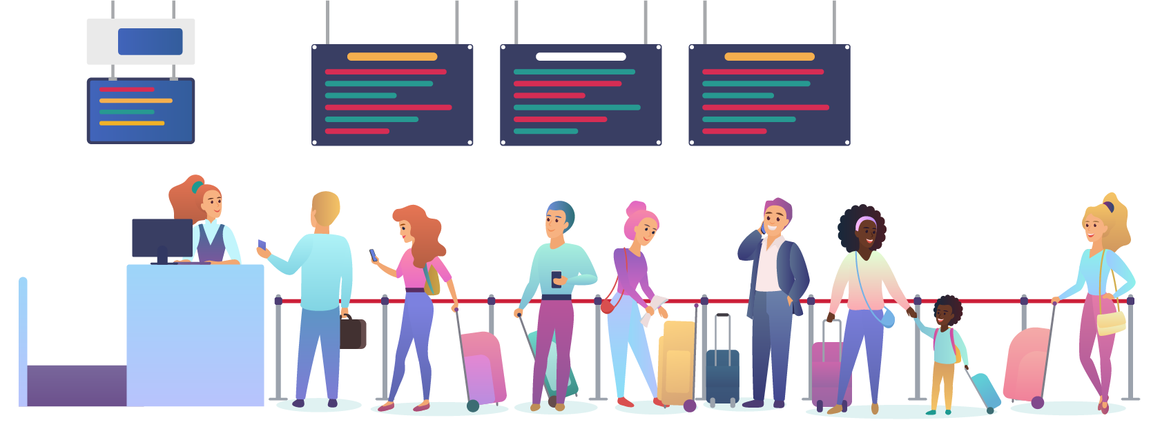
People who travel from one place to another through flights face number of challenges at the airports. Navigating through airports is an overwhelming process because of various procedures such as check in, security check, custom cleareance etc. Because of the complexity, people try to reach the airports well advance in time to be able to go through the process and reach their correct gate number beforehand.
Factors such as language barrier, improper signage, complex procedure, etc. add to the difficulity of navigating through the airports. People seek assistance or guidance at various steps to be able to reach their assigned gate number.
Aim: To solve the navigation problem of individuals who are traveling through airports and face challenges due to various barriers.
Duration
4-6 Weeks
My Role
User Research
User Data Analysis
Brainstorming
Prototyping
Usability Testing
The Process
We started with understanding the problem scenario by conducting background research and framed the problem to understand user pain points during their navigation experience. We then moved on to recruiting participants for the user research to find out details on issues and requirements by conducting surveys, interviews and market analysis with our target users. The next step was to analyze the data and highlight the important insights as well as to create user personas. We then generated a list of required features and created initial sketches and storyboard scenarios to give an overview of the design being used in user’s enviroment. After conceptualization, we designed the low fidelity prototype and tested it with users. From the feedback we received we made the required changes and created the final high fidelity prototype and worked on the UI element. We again conducted usability testing with users and reiterated on the prototype. We noted down the learnings from our project and the future steps as well.

Problem Space
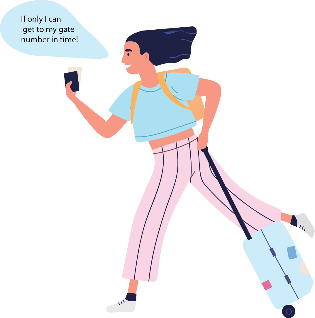
Despite having navigation signs and customer service desks available at various parts of the airport, people face difficulties navigating to their gate numbers.
Empathy Driven Challenge: This challenge was inspired by people around us i.e. friends, families & classmates. Moreover, by people of one country traveling internationally around the world.
Research on the problem space has led to the following factors being the main reasons for the challenge –
1. Language Barrier – Inability to communicate in foreign language other than own native language.
2. Complex Procedure – Complexity arises due to multiple stages(security, check-in etc.) at the airport.
3. Improper Signage – Lack of proper leading signs to the gate number.
Hence, a person faces many issues & difficulties when travelling away from home country.
Framing the Problem
_____________________________
“How to provide travelers with a seamless navigation system that would also overcome the communication barrier?”
______________________________
Research & Analysis
After identifying the problem, the next was to dig deeper to understand who are the target users that are heavily affected and to what extend do they face issues while navigating through the airport to reach their gate numbers.
Qualitative Interviews
We got to interview and speak to people from diverse backgrounds and age groups to get knowledge about their experiences at the airport as well to understand their requirements.

Once I walk in the airport I try to remember what procedures I have to go through so I can prepare myself beforehand but only end up getting more confused.
– Amit Singh, Student

Because English is not my first language, international traveling is very hard for me. Everything is written in English and I have to ask for help at each point to understand where I am supposed to go. – Glizia Ber, Student

During my transit flight from CDG Paris to New Delhi, I remember I along with many other almost walked into wall behind a board because the sign was pointing that way.
-Tingling Wu, Student
Surveys
We also conducted survey with our target users to collect domain-specific information and to get insights about their views towards the current media in existence.
Our target users were in the age group of 18 to 60 because we identified them to be our core base.
We received 20 responses:
13 Male | 7 Females
Age : 21 to 60 years old
Comparative
Market Analysis
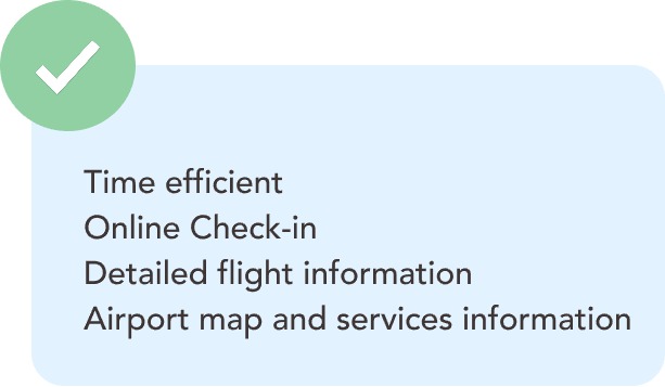
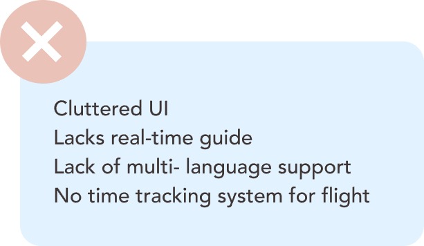
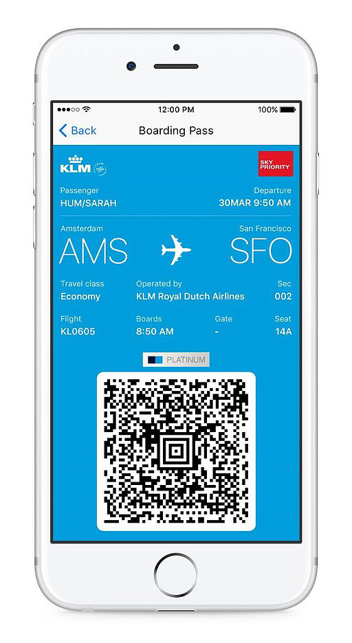
We conducted a market analysis to understand the current systems in existence and studied their value proposition and limitations.
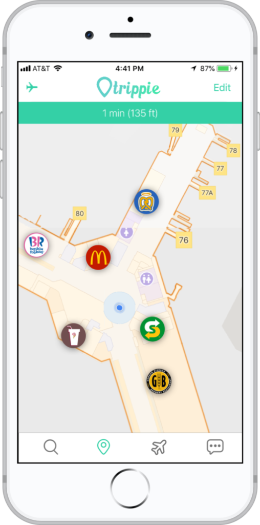
There are many airlines that offer boarding pass through their applications but they do not offer a real-time navigation, language options or important procedure information.
Insights
After conducting surveys and countless interviews, we analyzed the data and were able to generate the following insights.
- No digital guide for the location of services and amenities nearby.
- Currently there is no system to provide real-time navigation guidance to users.
- No prior knowledge of the stoppages inside airport such as checkin, security checks etc.
- Language barrier is an issue for most of the users who are foreigners, aged or are flying for the first time.
- Airports lack the terminal signage and/or have wrong signs are present at various location inside the airports.
User Personas
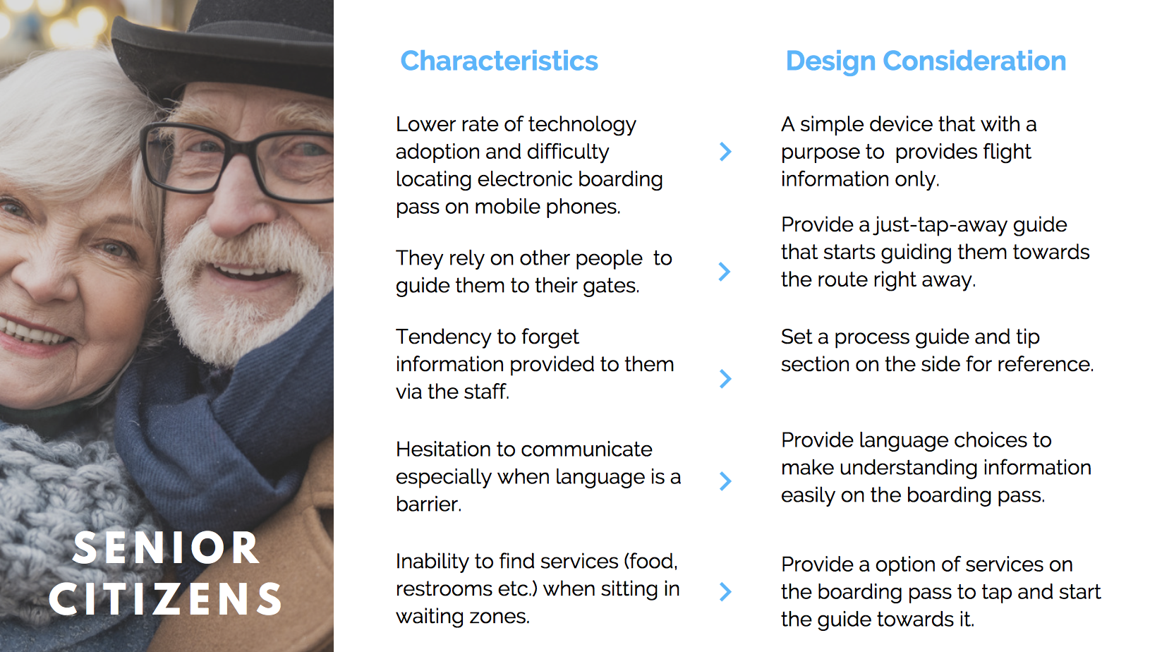
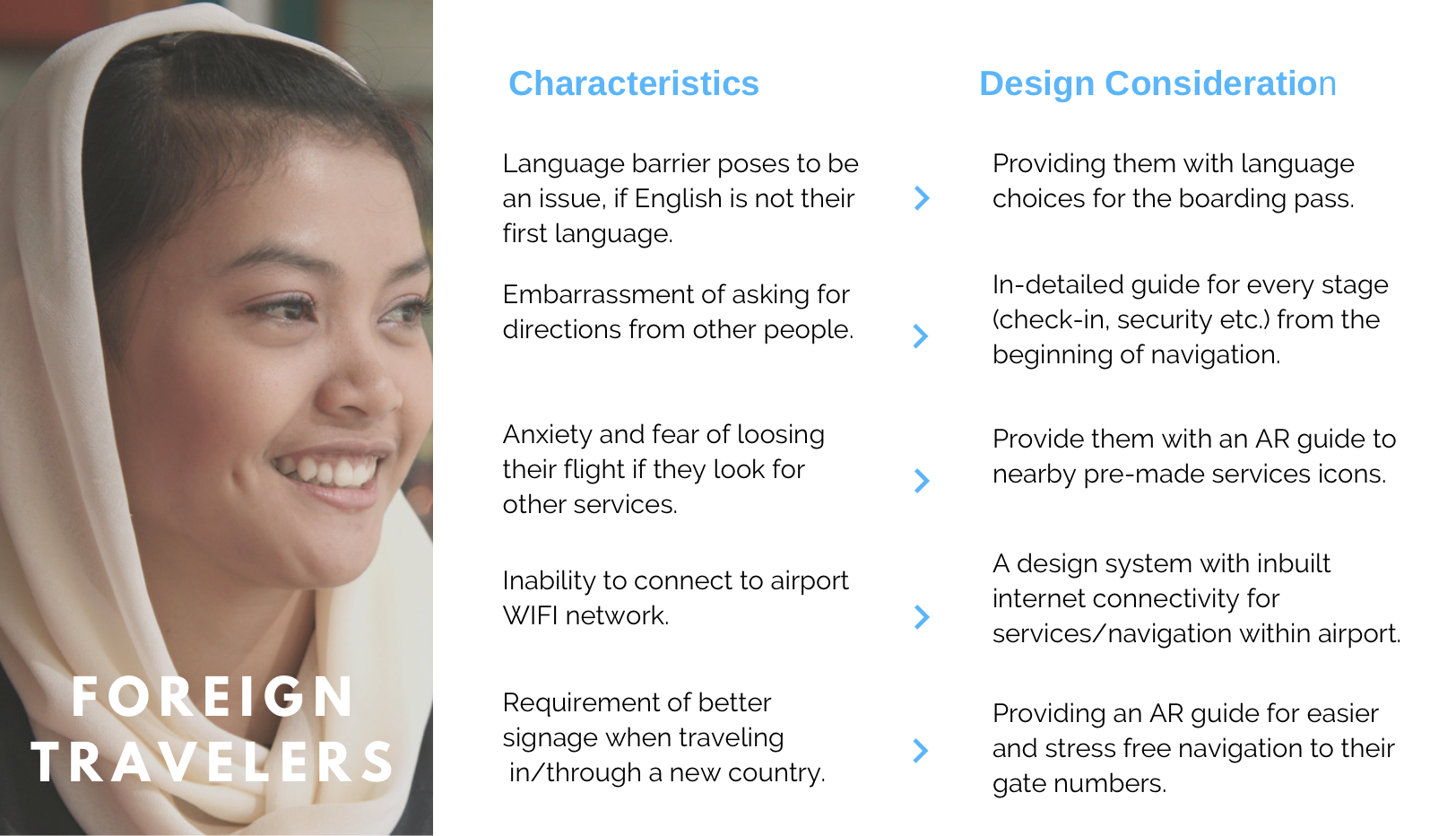
Based on our research, we realized that almsot every user has faced certain circumstances while traveling but we decided to focus on two user groups: foreigners and senior citizens. Since we could not narrow down our user groups based solely on our evidence, we tried to focus on these two user groups and believed that if we go in-depth on their requirements, the design system can also be adopted by other users as well.
Conceptualization
Feature Narrative
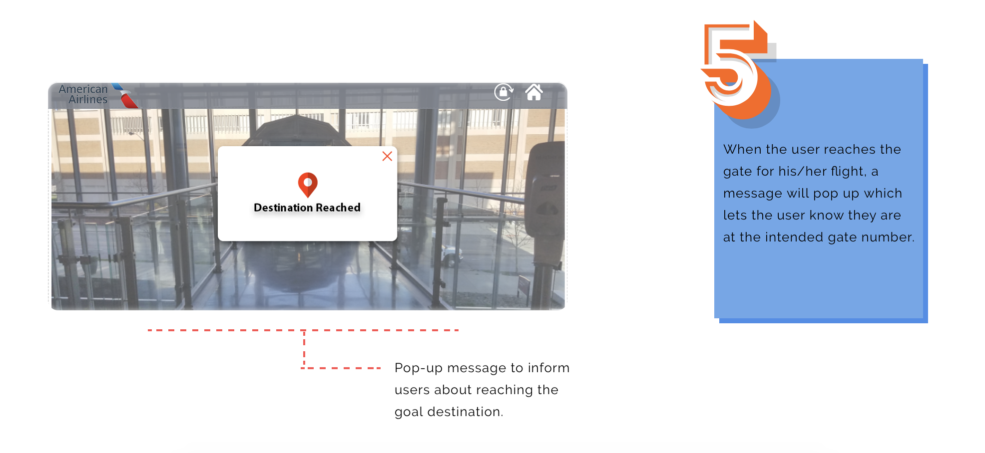
- Seamless Navigation – Provide the user with boarding pass embedded with augmented reality to navigate easily.
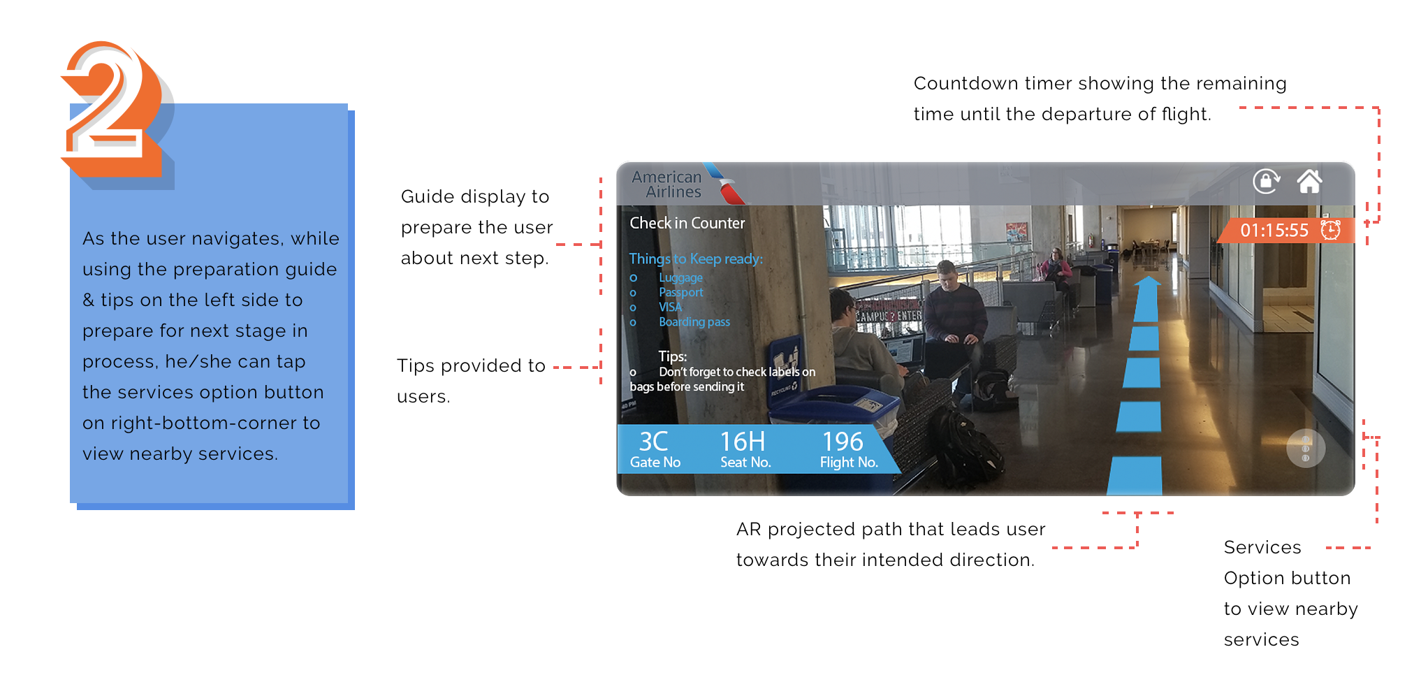
- Preparation Guide – A guide with next step information & tips will be provided to help the users prepare themselves.
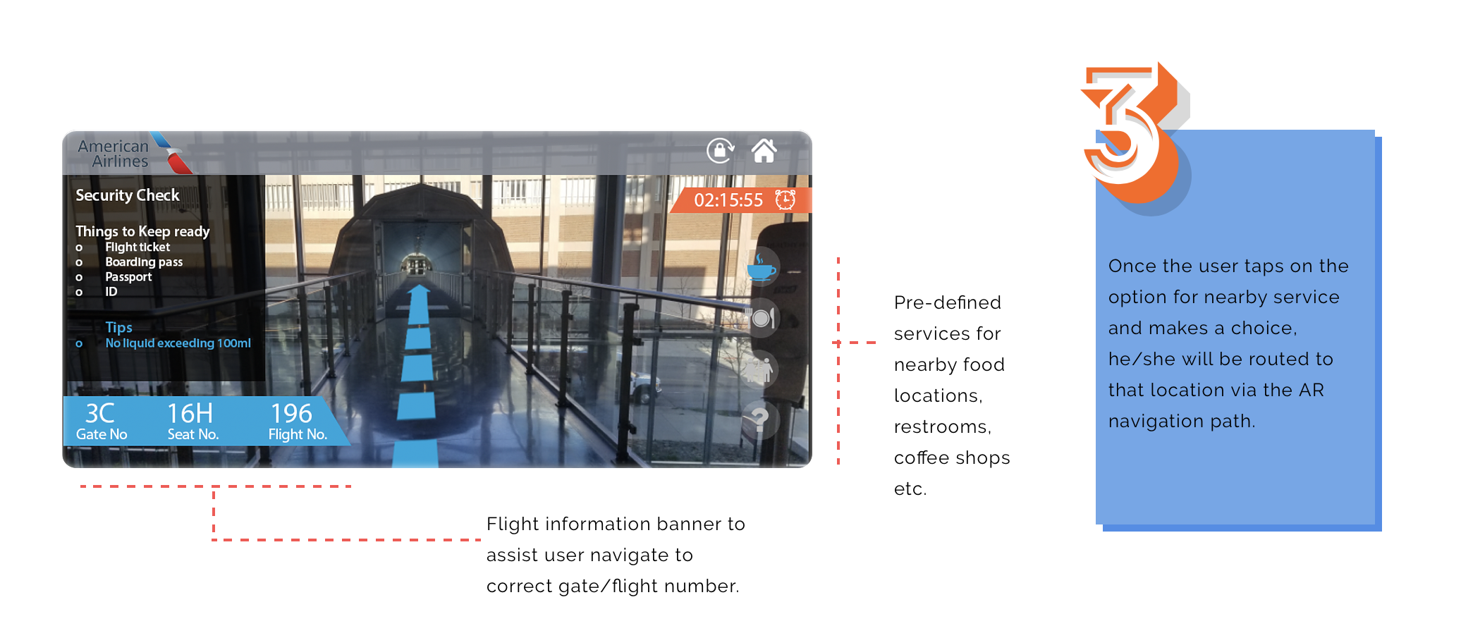
- Locating Serives – The design solutio will provide users with options for nearby services within reach.
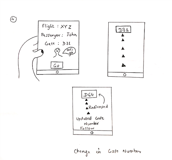
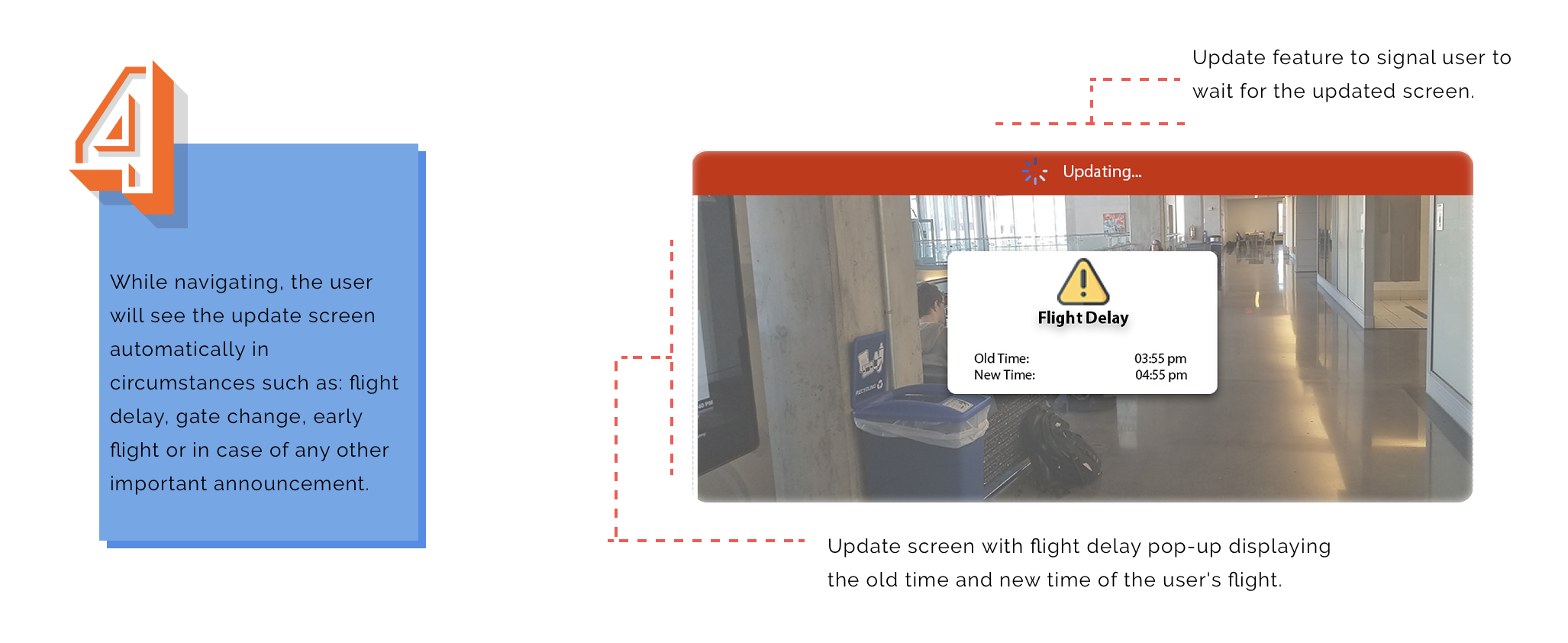
- Real-time Updating – The user will be able see the real-time changes such as flight delays, gate change etc. updated instantly.
Conceptualization
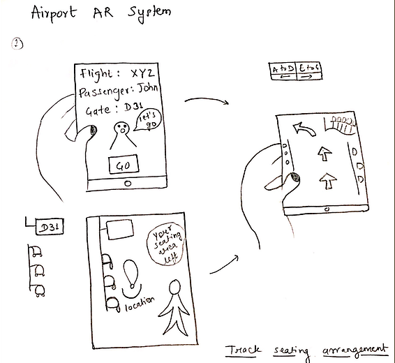
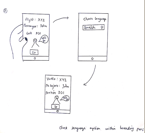
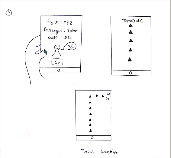
With a handful of thoughts and ideas, we came up with many design solutions to solve the problem of navigation on airports. We decided to create as many sketches as possible to gain an opportunity to understand what would work best for our focused area and how good it can be proved to be move forward with it.
Storyboard Scenarios
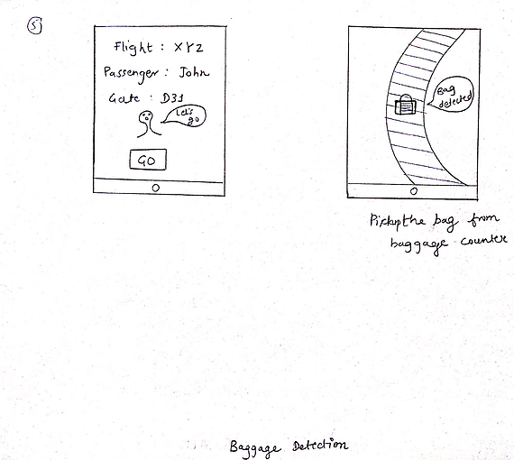
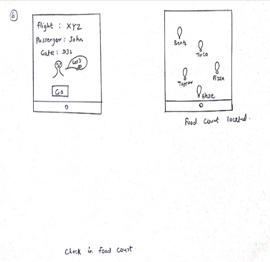
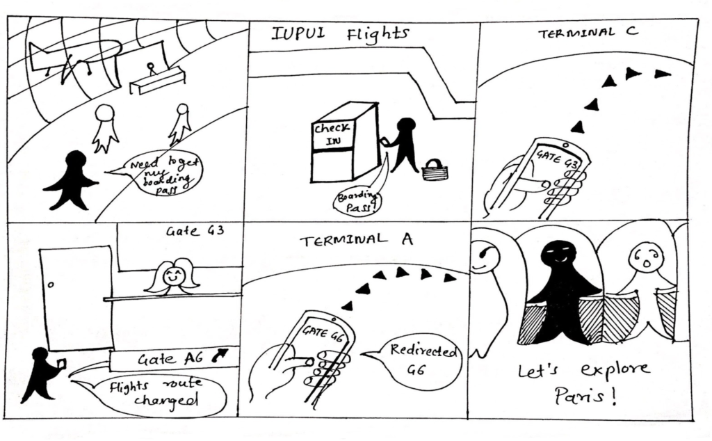
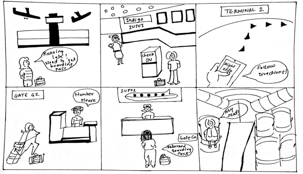
We created two scenarios to depict the use cases for the design concept and to understand the flow of people’s interaction with the proposed design. The storyboards have been divided into two parts :
Design Process
Low-Fidelity Design
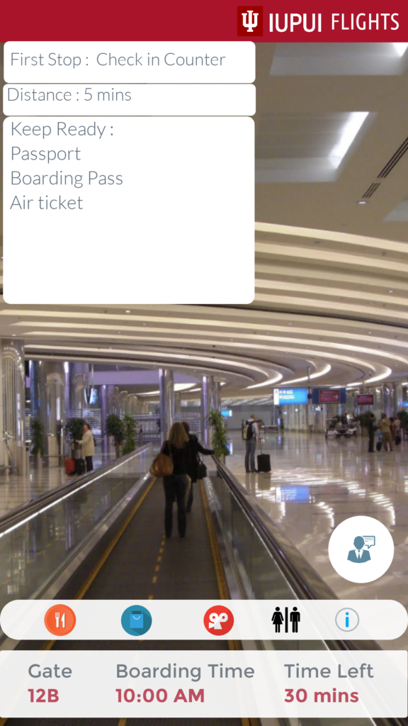
Below are the designs of the initial low-fidelity screens that were created after deciding on the main features. The screen were designed mainly focusing on how to provide users with on screen instructions as well as enabling them to use the augmeted guide from within the app.
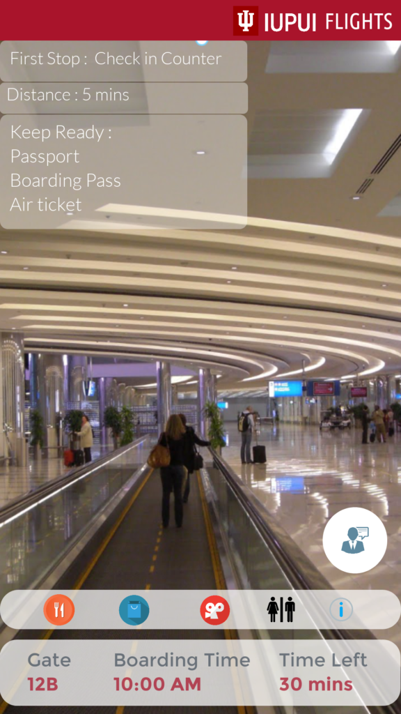
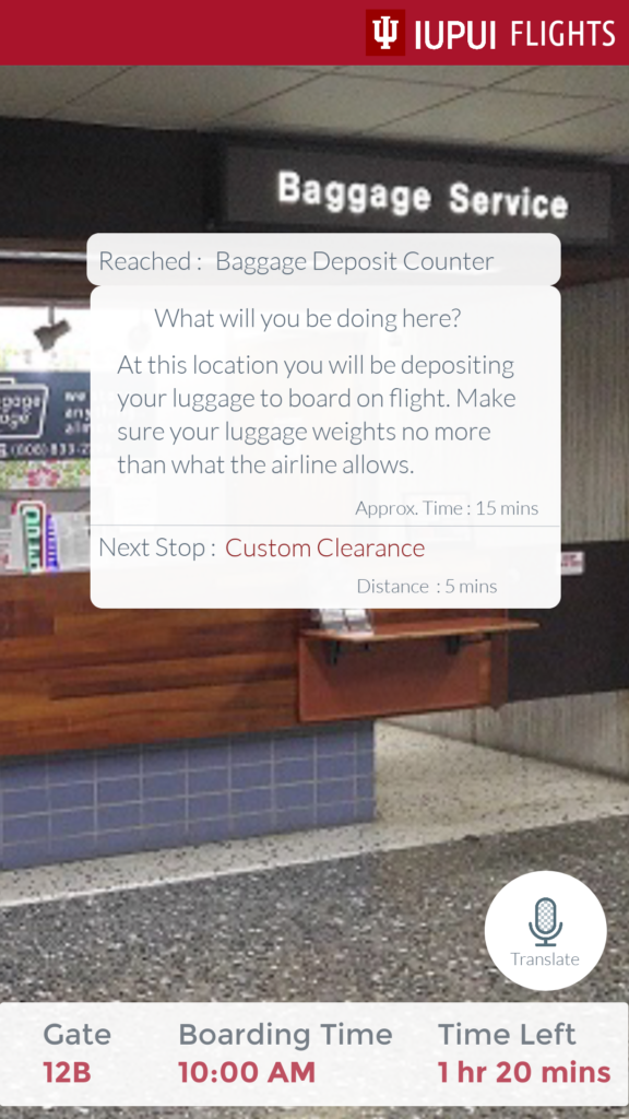
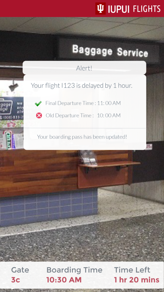

Final Design
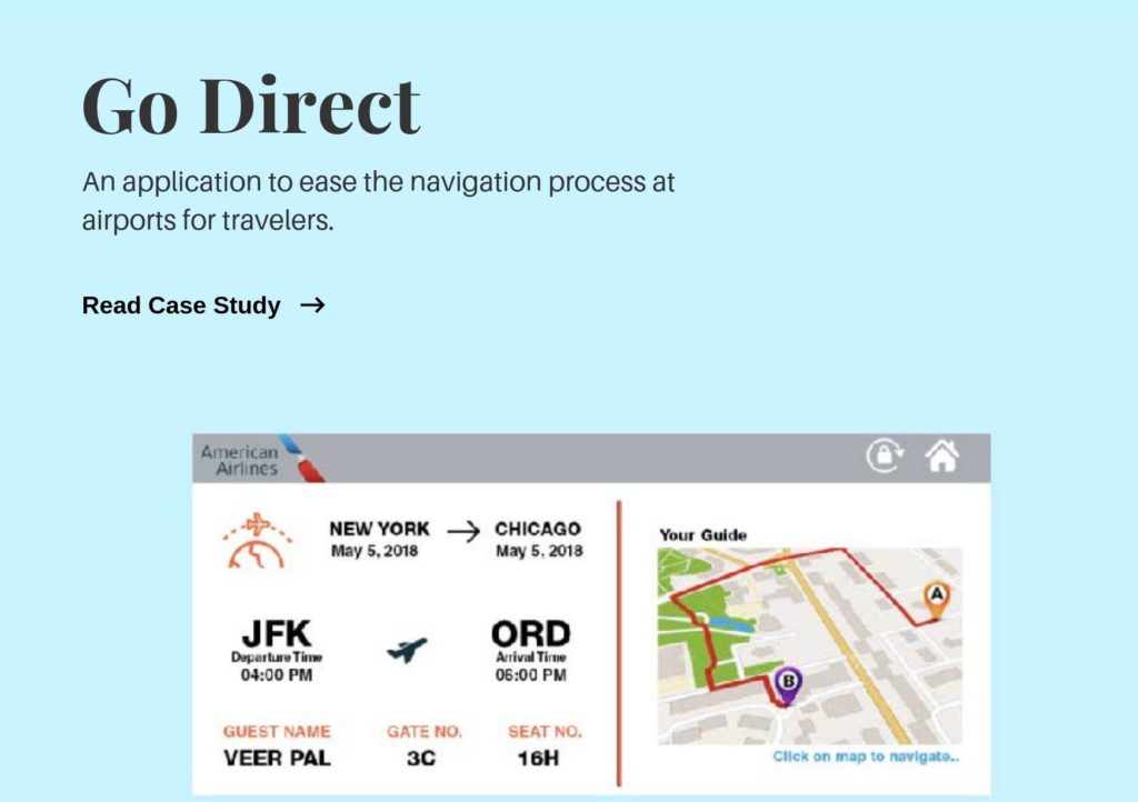
After multiple interaction on the low-fidelity prototype, we created out final design. Below are few of the final screens that present the main features of the designed system and detailed user flow related to each function.
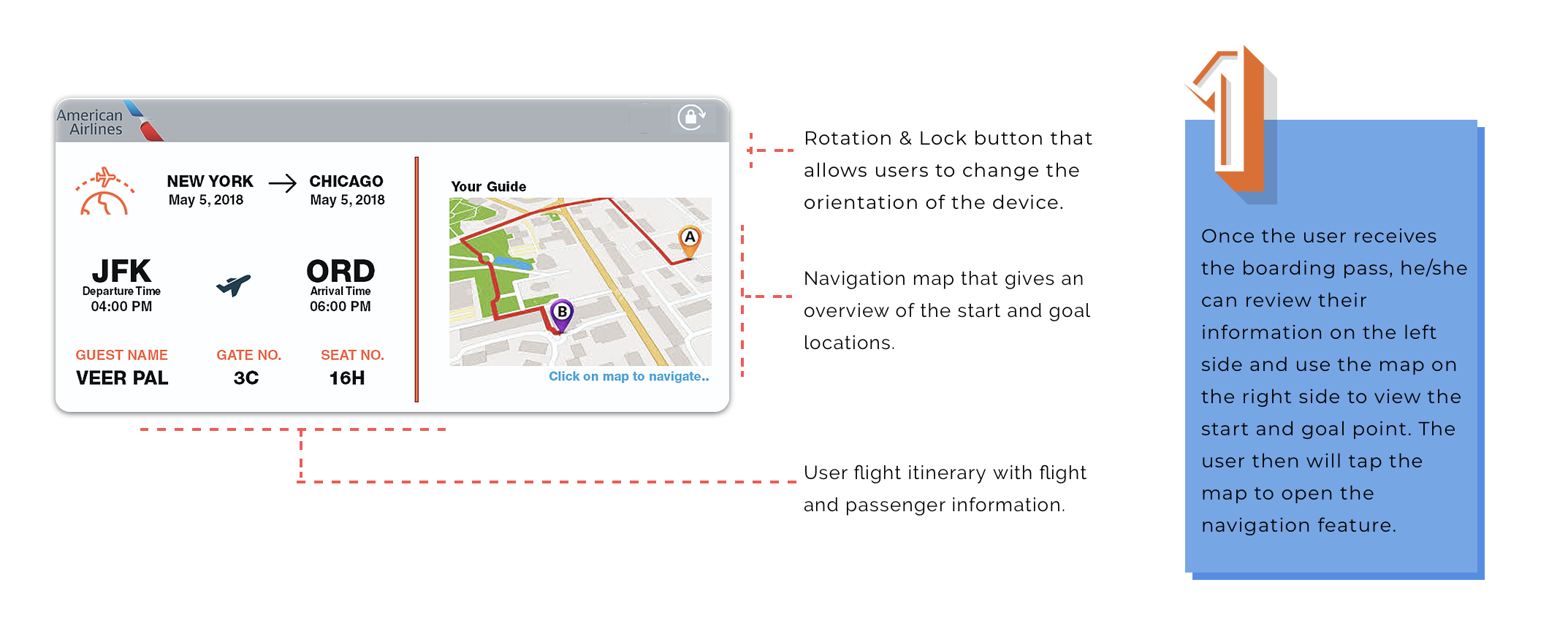
User Flow
Usability Testing
For the initial testing method, we used a cognitive walkthrough to test our paper prototype. It was hard to test the AR features as the technology to represent the feature were not available for us. We had to act the part where the AR technology was required in the testing method.
1. Digital device would be expensive – Users mentioned that the implentation and regulation of digital devices would be expensive
Solution – Collection of boarding pass at the deporting gate before the user enters the flight.
2. Some screens were intentionally created in landscape mode while others in portrait mode as well as few screen didn’t have home button and gesture input was required which confused the users.
Solution – Addition of rotation lock, home and back buttons on the screens.
3. Need of more probes to give users better understanding of the augmented reality technology.
Solution – Include videos to explain the scenarios to the users.
Project Learnings
1. Minimal design – Users did not prefer the busy interface with all the options present in the key and wanted minimal design that didn’t have a high learning curve.
2. Reach the saturation point – It is important to keep gaining user feedback until their is no new data being received from the research.
3. Gain early feedback and iterate – Whenever possible involve users to get feedback on the designed system to improve the design and save ample amount of time.
Future Steps
1. Voice assistance – Guide and feature selection by giving voice commands.
2. Translator – Addition of translator to enhance communication between the travelers and the airport staff.
3. Entertainment Options – Incorporate feature such as games, internet etc. for travelers while they are waiting for flight.
Other Projects
Let's Connect
Feel free to reach out for collaboration or just to say Hi!
Veer41177gmail.com
